Norma Editorial
40 years of stories
Our first approach for the Norma Editorial site was a catalog of stereotypes: we had grown up with them, devoured their pages and learned to draw by copying their comic strips... it was impossible not to try to make a "soup" with the best of our youth. The "soup," obviously, proved inedible.
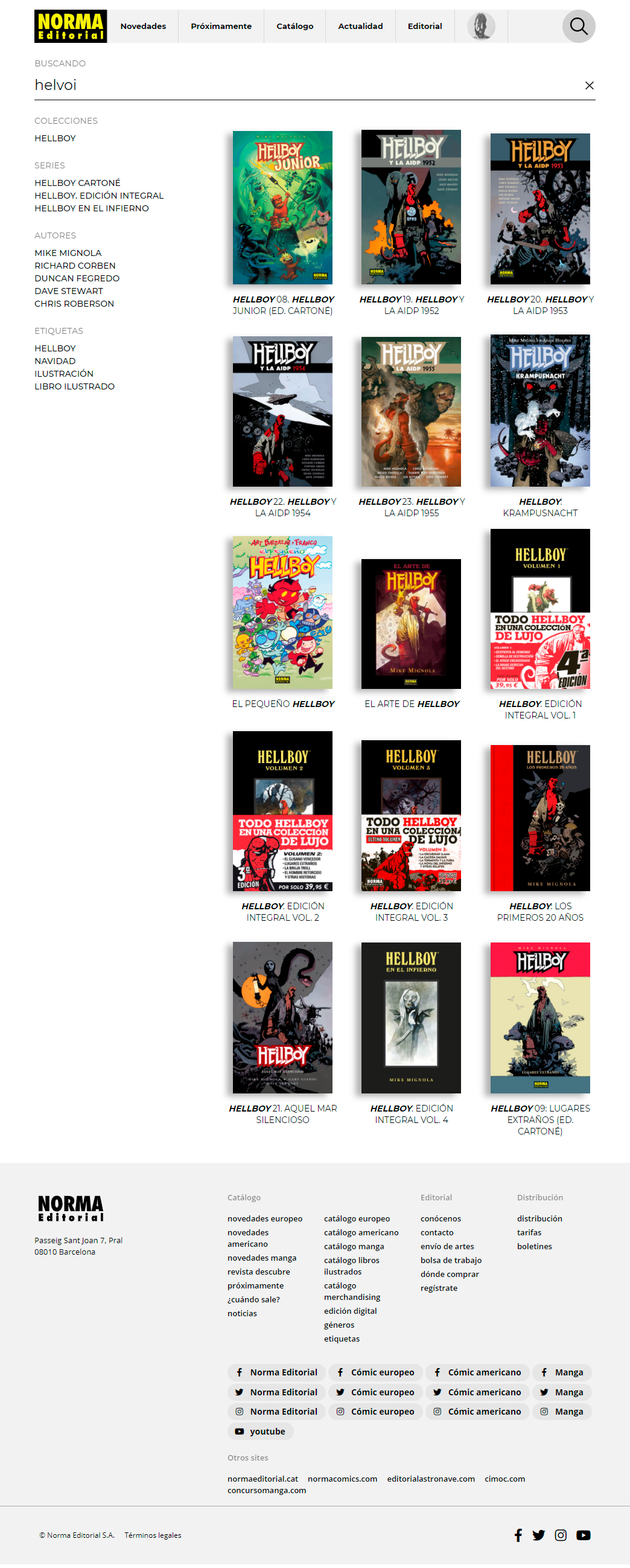
Luckily, at Norma Editorial they are used to provoking this type of reaction to those who start working with them and it wasn't hard for us to understand "what" was needed and propose a "how". The entire architecture of the site is user-oriented, smart searches, related content, a responsive behavior that affects not only the display but also the content ... every detail treated in detail, honoring our youth companions.
development
development
Search-oriented architecture
If Mr. Katsuhiro Otomo was called Tony, we wouldn't need engines capable of reading our minds. Looking over the catalog of Norma Editorial we can see that the small amount of Tonys forces us to have a search-oriented architecture at the height of Mrs. Fletcher.

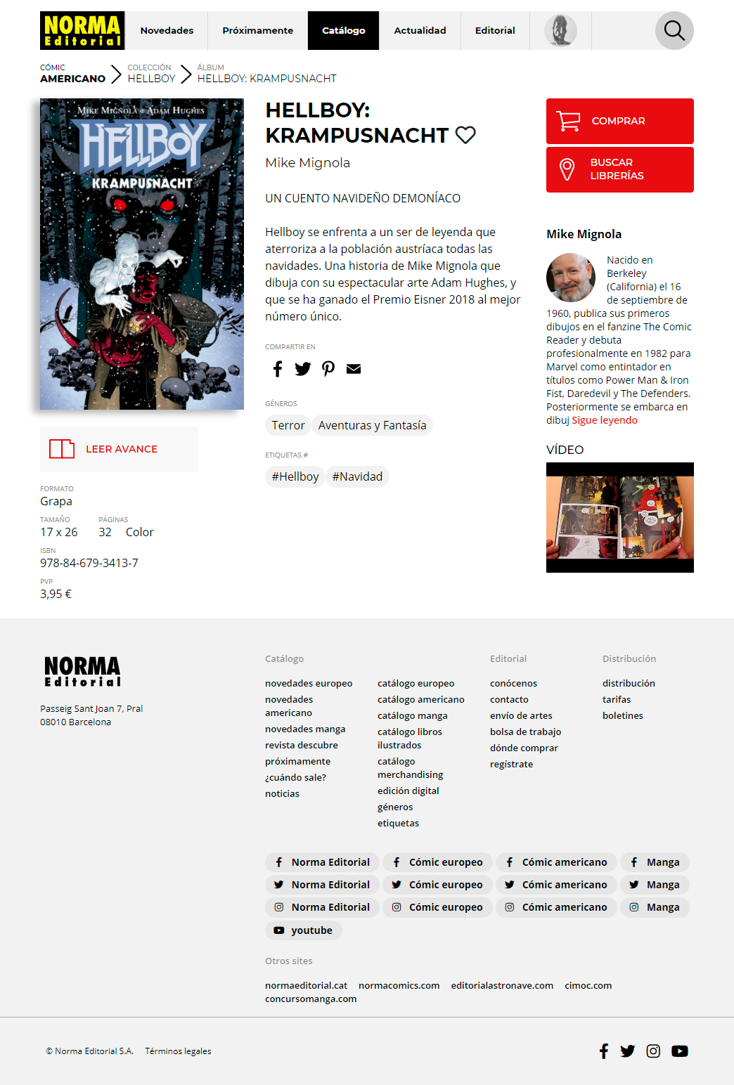
Everything is related: an album can be related to other titles in many ways, by themes, series, authors ... Even news that relate them temporarily ... Watch all these relationships and show them when and how they are most needed generates a transversal navigation, parallel to the traditional tree, which brings us closer to the expert bookseller instead of abandoning us in a traditional catalog.

